Dev log 24 DevAccessibility
WCAG 2.2: the nine new success criteria and how to meet them
You’ve been asked to bring a site up to WCAG 2.2, and you want to know what changed. It’s less work than it sounds. WCAG 2.2 adds nine new success criteria and removes one old one. If your site already meets WCAG 2.1 AA, you need six more to reach 2.2 AA, and most are small fixes.
WCAG is the main web accessibility standard. A success criterion is one testable rule, at level A, AA or AAA (the strictest).
WCAG 2.2 became a W3C Recommendation (a finished standard) on 5 October 2023. It keeps everything from 2.1. Level AA now means 55 success criteria, 31 at level A and 24 at level AA.
The nine new criteria
| Criterion | Level | In one line |
|---|---|---|
| 2.4.11 Focus Not Obscured (Minimum) | AA | A focused element is never completely hidden. |
| 2.4.12 Focus Not Obscured (Enhanced) | AAA | No part of it is hidden. |
| 2.4.13 Focus Appearance | AAA | The focus indicator is big enough and has enough contrast. |
| 2.5.7 Dragging Movements | AA | Anything you can drag, you can also do with a click or tap. |
| 2.5.8 Target Size (Minimum) | AA | Targets are at least 24 by 24 CSS pixels, or spaced out. |
| 3.2.6 Consistent Help | A | Help is in the same place on every page. |
| 3.3.7 Redundant Entry | A | Don’t make people type the same thing twice. |
| 3.3.8 Accessible Authentication (Minimum) | AA | Logging in never depends on memory or puzzles alone. |
| 3.3.9 Accessible Authentication (Enhanced) | AAA | The same, with fewer exceptions. |
One criterion was removed. 4.1.1 Parsing is now obsolete, because browsers and assistive technology (like screen readers) stopped needing perfectly valid markup long ago.
2.4.11 Focus Not Obscured (Minimum), AA
When an element gets keyboard focus, content you put on the page must not hide it completely. Sticky headers, cookie banners and chat widgets are the usual problem. You tab down the page and the focused link slides under the header. It’s like someone standing in front of the sign you’re trying to read.
For sticky headers, the fix is one line of CSS. I add it on every site that has one. scroll-padding-top tells the browser to keep that much space clear when it scrolls something into view. That includes moving focus.
html {
  scroll-padding-top: 110px; /* at least the height of the sticky header */
}
For banners and widgets fixed to the bottom of the screen, add a matching scroll-padding-bottom. Or let people close them. I’d never cover the main content by default.
2.4.13 Focus Appearance, AAA
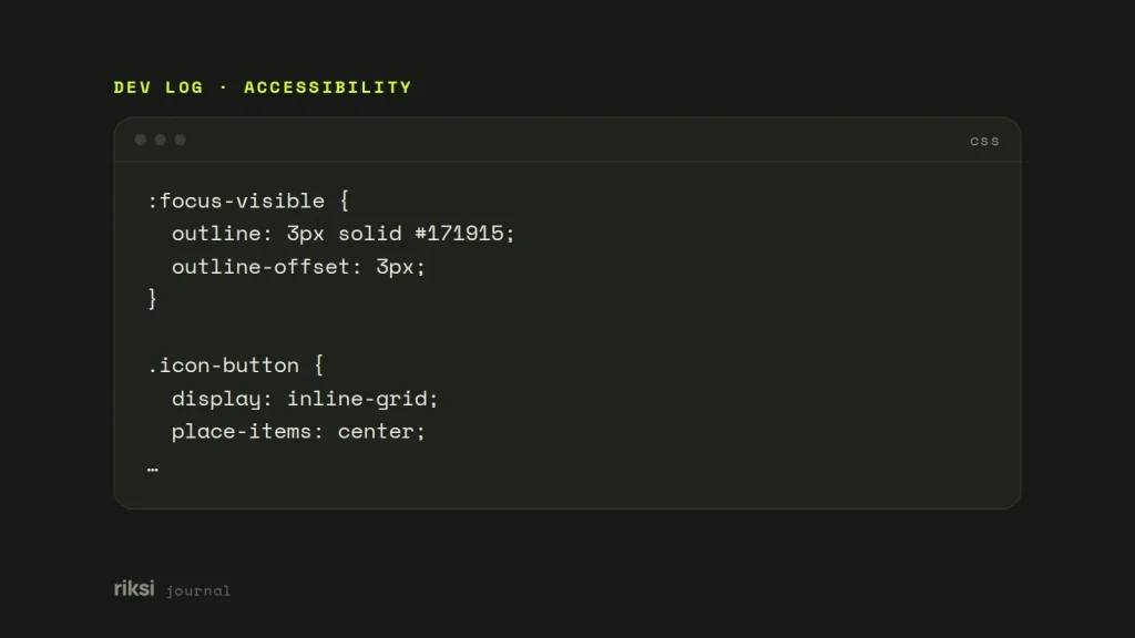
It’s AAA, but I’d still do it because it’s cheap. The focus indicator should be at least as large as a 2 CSS pixel outline around the element. It should also change contrast by at least 3:1.
A solid outline with a small offset meets it and looks intentional. Yes, AAA sounds like a lot of work. This one is two CSS properties.
:focus-visible {
  outline: 3px solid #171915;
  outline-offset: 3px;
}
On dark sections, change the colour instead of removing the outline. With a custom property, set --focus on the dark section and use outline-color: var(--focus, #171915).
2.5.7 Dragging Movements, AA
Anything that works by dragging must also work with single clicks or taps. The exception is when dragging is essential. Sliders, sortable lists, kanban boards and map panning are the common cases. Dragging is hard or impossible for people using a head pointer, an eye tracker or a shaky hand.
My advice is to add buttons next to the drag action. Dragging can stay, as long as it isn’t the only way.
- Plus and minus buttons on a range slider.
- “Move up” and “move down” buttons on a sortable list.
- A menu to move a card to another column.
A native <input type="range"> already handles arrow keys and clicks on the track. The browser solved this one long before WCAG 2.2 asked for it.
2.5.8 Target Size (Minimum), AA
A target is anything you click or tap. It needs to be at least 24 by 24 CSS pixels, or have enough space around it. Picture a 24 pixel circle centred on each target. The circles must not overlap.
Links inside a sentence are an exception, and so are controls whose size the browser decides.
I’d check icon buttons first, because they’re where most sites fail. Think of a 16 pixel close icon, packed social links or tiny pagination. Size the clickable element, not only the icon. 24 pixels is small. It’s the minimum, not the goal.
.icon-button {
  display: inline-grid;
  place-items: center;
  min-width: 24px;
  min-height: 24px;
  padding: 10px; /* 44px or more is kinder on touch screens */
}
3.2.6 Consistent Help, A
You might offer help such as a phone number, contact link, chat widget or help page. If it’s on several pages, it must appear in the same relative order each time. A site-wide header or footer with the same contact options meets this with no extra work.
3.3.7 Redundant Entry, A
Within one process, don’t make people type something twice. Fill it in for them, or let them pick it. The classic case is a checkout that asks for a delivery address, then a billing address. It’s like being asked for your name twice by the same person, one minute apart.
A “same as delivery address” checkbox fixes that one. On every form, set autocomplete attributes properly so the browser can help too.
<label for="email">Email address</label>
<input id="email" name="email" type="email" autocomplete="email">

<label for="street">Street address</label>
<input id="street" name="street" autocomplete="street-address">
There are exceptions for security, for information that is no longer valid, and where typing it again is essential, such as confirming a new password.
3.3.8 Accessible Authentication (Minimum), AA
Logging in must not depend only on a cognitive function test. That is a memory or thinking task, such as remembering a password, solving a puzzle or copying characters. If you use one, offer another option or some help. In practice:
- Let password managers work. Use proper
autocomplete="username"andautocomplete="current-password"attributes. - Never block paste into password or code fields.
- Offer other ways to log in, such as email links, passkeys or signing in with an existing account.
- Be careful with CAPTCHAs. At level AA, picking out objects (“select the traffic lights”) is allowed. Copying text from a puzzle is not, unless there is another option.
- Invisible checks, like Cloudflare Turnstile in its non-interactive modes, avoid the problem for most visitors.
<label for="password">Password</label>
<input id="password" name="password" type="password" autocomplete="current-password">
<!-- no onpaste="return false" -->
If I had to pick one fix from this section, it would be letting people paste. It takes seconds and helps anyone with a password manager. Blocking paste doesn’t make a password safer. It only makes a long password harder to enter.
The AAA version, 3.3.9, also rules out object recognition and personal content, like picking out your own photos.
Where to start
- Tab through your main pages with the sticky header in place. Watch where focus goes.
- Measure your smallest buttons and links, especially icons and social links.
- List anything that needs dragging, and add a click option.
- Go through your longest form and your login. Remove anything that asks twice or blocks paste.
- Check that your contact and help options sit in the same place on every page.
None of these need a redesign. Most are a few lines of CSS or a better form attribute. Each one makes the site easier for everyone, not only for people using assistive technology.
I’d start with the sticky header and the paste fix, since both take minutes. Then work down the list one page at a time. The Tab key is already on your keyboard, so the first test can start now.
Comments
No comments yet. Questions, fixes and better ways are all welcome.