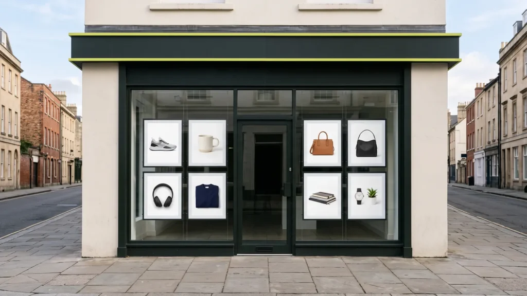
Your product photos are your shop window. Online, nobody can pick up the product, turn it over or feel the fabric. The photo is all they have, so it’s the first thing their eyes go to and the main thing they judge you on. Good, consistent photos make a small shop look trustworthy. Poor ones make a great product look cheap.
By the end of this guide you’ll know how to shoot photos customers want to look at. You’ll also know which sizes and backgrounds to use, and how to keep them fast. You don’t need a studio. A phone, a window and a sheet of white card go a long way.
Why product photos matter so much
Picture walking past two shops. One has a tidy, well-lit window. The other has boxes stacked in the dark. You know which one you’d walk into. Your product page works the same way.
The research backs this up. Baymard Institute, which tests online shops with real users, found that 56% of people start a product page by looking through the images. It also found that 25% of shops don’t offer enough image resolution or zoom.
So before you spend money on ads, I’d look hard at your photos. Ads bring people to the window. Photos decide whether they walk in.
Shoot the photos customers want to see
Think like a shopper. What would you want to check before you paid? Then show exactly that.
- A clean main photo. The whole product, front on, on a plain background. This is the one in your product grid.
- Every side. Front, back, side and top. For clothing, show it worn as well as flat.
- Close-ups. Stitching, texture, buttons, ports, labels. This is where people decide on quality.
- Something for scale. Baymard found 42% of shoppers try to judge size from photos. Show the product in a hand, on a desk or next to something everyone knows.
- The product in use. A lifestyle photo helps people picture it in their own home or life.
Light matters more than the camera. Soft daylight from a window, with a white card on the other side to fill the shadows, beats a harsh flash every time. Turn off the room lights, so you don’t mix warm and cool light. And clean the product first. A camera finds every speck of dust you missed.
Keep every photo consistent
This is the trick that makes a small shop look like a big brand. When every photo has the same background, angle and framing, your product grid looks calm and professional. When they’re all different, it looks like a garage sale.
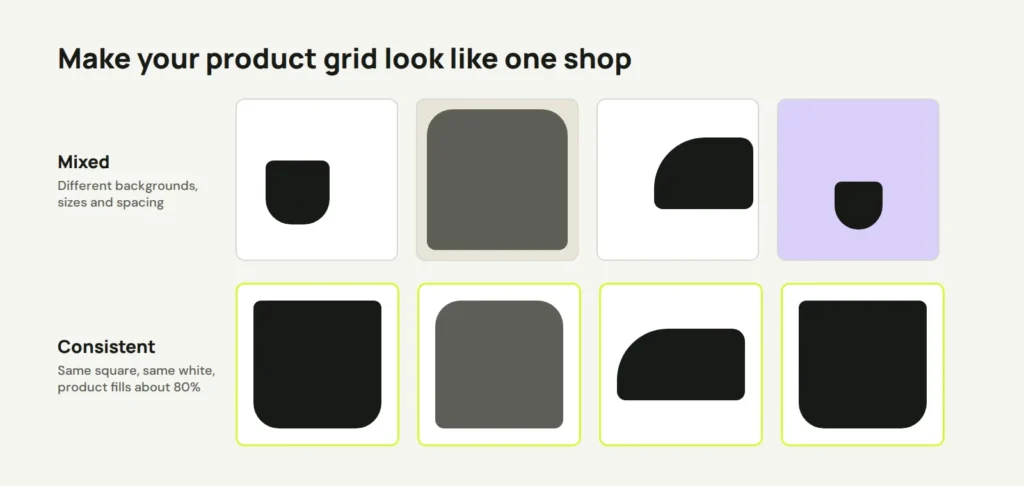
- Use the same shape for every main photo. Square (1:1) is the safest, because most themes and marketplaces use it.
- Shoot from the same angle and height each time. Mark the spot for your phone and the product with tape.
- Keep the product the same size in the frame. Google asks for the product to take up 75% to 90% of the image.
- Use the same light and the same editing settings for the whole range.
White or transparent background?
For your main photos, I’d use pure white. It looks clean on almost any website, and it’s what the big marketplaces expect. Amazon’s main image must be pure white (RGB 255, 255, 255), with the product filling 85% or more of the frame. If you might sell on Amazon or show up in Google Shopping one day, shoot for that standard from the start.
Transparent backgrounds (PNG files) are handy in some places. They suit a design where products sit on a coloured section, or on a banner. But they have catches. Transparent PNGs are usually bigger files, and they can look odd if the background behind them changes. Keep a transparent version for design work, and use white on product pages.
Whatever you choose, don’t add text, borders or watermarks to the main photo. Google Merchant Center doesn’t allow promotional text, watermarks or borders on product images. Your lifestyle and detail photos are the place for extra style.
Get the size right, and keep it fast
Photos need to be big enough to zoom, but light enough to load quickly on a phone. Here’s what I aim for:
- Upload around 2000 × 2000 pixels for square product photos. That’s sharp enough for zoom. Google recommends 1500 × 1500 or more, and Amazon needs at least 1000 pixels on the longest side for zoom to work.
- On Shopify, upload the best quality you have. Shopify’s help page says images “don’t need to be manually compressed prior to uploading.” It resizes them and serves the best format for each browser by itself. The limit is 20 megapixels or 20 MB.
- On WordPress with WooCommerce, compression is up to you. Resize photos before uploading, and use WebP where you can. On classic themes, set the crop in Appearance → Customize → WooCommerce → Product Images. Choose 1:1 to keep the grid tidy, then regenerate thumbnails so older photos match.
- Give each file a name that describes it, like
blue-linen-shirt-front.jpg, notIMG_4821.jpg. - Write alt text for every photo, saying what it shows. It helps people using screen readers, and it helps Google understand the image.
Big, unoptimised photos are one of the most common reasons a shop feels slow. My guide to speeding up a slow WordPress site covers that in more detail.
Check your shop window
Open your shop on your phone and scroll through the product grid. Does it look like one shop, or many? Then open a product and zoom in. Can you see the detail you’d want before buying? If not, start with your ten best-selling products. Reshoot them in the same style, and see how they look side by side.
If you’d like a hand, Riksi can set up your product pages, image sizes and zoom so your photos look their best and load fast. That’s part of our site updates service. Either way, treat your photos like your shop window, and keep them clean.
Opens in a new tab


Comments
No comments yet. Questions, fixes and better ways are all welcome.