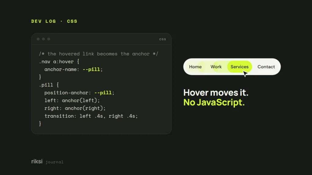
You can make an element jump to whichever item the mouse is over using CSS anchor positioning, with no JavaScript at all. The hovered item gets an anchor-name, and the moving element follows that name. Add a transition, and it slides there.
Before we get to the fun part, let’s look at why this matters. CSS now handles a lot of jobs that used to need a script.
Modern CSS is doing JavaScript’s old jobs
For years, anything that moved, opened or reacted needed JavaScript. Every script is more to download, more to run, and one more thing that can break. Less JavaScript usually means a faster page, which helps your Core Web Vitals too.
These modern CSS features each replace something we used to script:
:has(), the “parent selector”. Style a card when its checkbox is ticked, or a form when a field is invalid.- Container queries. A component changes its layout based on the space it has, not the whole screen.
- The
popoverattribute and<dialog>. Menus, pop-ups and modals that open, close and handle the Esc key by themselves. @starting-style. Smooth entry animations for things that appear, like a popover fading in.- Scroll-driven animations. Progress bars and reveal effects tied to scrolling, without a scroll listener.
- View transitions. Smooth animations between pages or states.
- Anchor positioning. Tooltips, menus and highlights that stick to another element. That’s today’s star.
Browser support differs for each one, so check Can I use before you rely on a feature. I’d still use them today, with a simple fallback, which I show at the end.
What anchor positioning does
MDN says anchor positioning lets you “tether elements together.” You tell one element, the anchor, its name. Then you tell another element to position itself against that name. The browser keeps them stuck together, even when the page scrolls or resizes.
These are the pieces you’ll use, from MDN’s guide:
anchor-name: --my-anchorgives an element a name. It must start with two dashes.position-anchor: --my-anchortells a positioned element which anchor to follow.anchor(left),anchor(top)and friends return the anchor’s edges, so you can use them inleft,topand so on.anchor-size(width)returns the anchor’s size.position-area: topis a shortcut that places the element on a side of the anchor.position-try-fallbacksgives backup positions when there isn’t enough room.
At the time of writing, Can I use lists support in Chrome and Edge 125+, Safari 26+ and Firefox 147+, around 86% of users worldwide. Some browsers still have partial support, so test your exact demo.
Here’s the trick that makes hover effects possible. An anchor name can move. If you give the name to whichever item is hovered, everything that follows the name moves with it.
Step by step: a sliding pill menu
Try it first. Move your mouse over the menu in the live demo below, or tap the links on a phone.
1. Write the HTML
A normal menu, plus one empty span for the pill. The aria-hidden keeps screen readers from announcing it, because it’s only decoration.
<nav class="nav">
  <a class="active" href="/">Home</a>
  <a href="/work/">Work</a>
  <a href="/services/">Services</a>
  <a href="/journal/">Journal</a>
  <span class="pill" aria-hidden="true"></span>
</nav>
2. Give the current page the name
When nobody is hovering, the pill should rest on the current page. So the link with the active class gets anchor-name: --pill.
3. Hand the name to the hovered link
Now any hovered or focused link takes the name. There’s one catch, and it’s an easy bug to hit. Two elements with the same anchor name confuse the browser. So the active link has to let go of the name while something else is hovered. That’s the job of :has().
The :not(:hover, :focus-visible) part matters too. Without it, hovering the active link itself would remove its name, and the pill would disappear.
4. Make the pill follow the name
The pill is absolutely positioned against --pill. Its four edges copy the anchor’s four edges with anchor(). When the name moves, the edges change, and the transition animates them. The bouncy cubic-bezier overshoots a little, which gives it that springy feel.
5. Put it all together
.nav {
  position: relative;
  display: flex;
  gap: 8px;
  padding: 10px;
  background: #171915;
  border-radius: 999px;
}
.nav a {
  position: relative;
  z-index: 1;
  padding: 16px 30px;
  color: #F5F5F0;
  text-decoration: none;
}

/* 1. By default, the current page is the anchor */
.nav a.active {
  anchor-name: --pill;
}

/* 2. While a link is hovered or focused, it takes the name instead */
.nav:has(a:is(:hover, :focus-visible)) a.active:not(:hover, :focus-visible) {
  anchor-name: none;
}
.nav a:is(:hover, :focus-visible) {
  anchor-name: --pill;
}
/* Dark text on the lime pill */
.nav a:is(:hover, :focus-visible),
.nav:not(:has(a:is(:hover, :focus-visible))) a.active {
  color: #171915;
}

/* 3. The pill follows whichever link is called --pill */
.pill {
  position: absolute;
  position-anchor: --pill;
  top: anchor(top);
  bottom: anchor(bottom);
  left: anchor(left);
  right: anchor(right);
  background: #D5FA35;
  border-radius: 999px;
  transition: left .45s, right .45s;
  transition-timing-function: cubic-bezier(.3, 1.5, .5, 1);
}
I added :focus-visible next to :hover everywhere. That way keyboard users get the same moving highlight when they press Tab. It costs nothing and it’s the right thing to do.
Three more creative examples
Every example below is a live demo, so hover over it, tap it or press Tab. Once you get the pattern, you’ll see it everywhere. The hovered thing gets the name. Something else follows the name. Here are three of my favourites.
A rubber band underline
This one uses a small trick. The left and right edges have different timing curves, so one edge leads and the other catches up. Moving right, the line stretches like a rubber band. Moving left, it scrunches up like an inchworm.
<div class="links">
  <a href="#">Design</a>
  <a href="#">Build</a>
  <a href="#">Launch</a>
  <a href="#">Grow</a>
  <span class="line" aria-hidden="true"></span>
</div>
.links {
position: relative;
display: flex;
gap: 40px;
}
.links a {
padding: 8px 0;
font: 800 32px/1 Manrope, sans-serif;
text-decoration: none;
}
.links a:first-child,
.links a:is(:hover, :focus-visible) {
anchor-name: --line;
}
.links:has(a:is(:hover, :focus-visible)) a:first-child:not(:hover, :focus-visible) {
anchor-name: none;
}
.line {
position: absolute;
position-anchor: --line;
top: anchor(bottom);
left: anchor(left);
right: anchor(right);
height: 10px;
border-radius: 10px;
background: #5B4AE8;
/* Two different curves: one edge leads, the other catches up */
transition:
left .5s cubic-bezier(.7, 0, .3, 1),
right .5s cubic-bezier(.2, 1, .3, 1);
}A spotlight that resizes to each card
Here the cards are different sizes. The spotlight uses anchor-size() to copy each card’s width and height, plus a little space around it. So it doesn’t just move, it grows and shrinks to fit. Great for pricing tables, feature grids or a portfolio.
<div class="cards">
  <div class="card">Featured</div>
  <div class="card">Speed</div>
  <div class="card">SEO</div>
  <div class="card">Accessibility</div>
  <span class="spot" aria-hidden="true"></span>
</div>
.cards {
position: relative;
display: grid;
grid-template-columns: 2fr 1fr 1fr;
grid-template-rows: 150px 150px;
gap: 18px;
width: min(100%, 640px);
}
.card {
padding: 20px;
border: 2px solid #D8D9D1;
border-radius: 20px;
background: #fff;
}
.cards > :first-child { grid-row: span 2; }
.cards > :nth-child(4) { grid-column: span 2; }
/* First card by default, the hovered card when there is one */
.cards:not(:has(.card:hover)) .card:first-child,
.cards .card:hover {
anchor-name: --spot;
}
.spot {
position: absolute;
position-anchor: --spot;
top: calc(anchor(top) - 10px);
left: calc(anchor(left) - 10px);
/* anchor-size() copies the card's size, plus 20px of breathing room */
width: calc(anchor-size(width) + 20px);
height: calc(anchor-size(height) + 20px);
border: 4px solid #D5FA35;
border-radius: 28px;
box-shadow: 0 0 0 8px rgb(213 250 53 / .25);
pointer-events: none;
transition: all .5s cubic-bezier(.3, 1.4, .5, 1);
}One tooltip that changes its words and flips
Normally you’d build one tooltip per button. This uses a single tooltip that jumps to whichever button is hovered. :has() swaps its text, and position-try-fallbacks: flip-block moves it below the button when there’s no room above.
<div class="tips">
  <span></span>
  <button class="top">Near the top</button>
  <span></span>
  <button class="save">Save draft</button>
  <button class="publish">Publish</button>
  <button class="share">Share</button>
  <span class="tip" aria-hidden="true"></span>
</div>
.tips {
display: grid;
grid-template-columns: repeat(3, auto);
justify-content: space-between;
align-content: space-between;
width: min(100%, 560px);
height: 250px;
}
.tips button {
padding: 12px 20px;
border: 2px solid #171915;
border-radius: 12px;
background: #fff;
cursor: pointer;
}
.tips button:is(:hover, :focus-visible) {
anchor-name: --tip;
}
.tip {
position: absolute;
position-anchor: --tip;
position-area: top; /* sit above the button */
position-try-fallbacks: flip-block; /* no room? go below */
margin: 12px;
padding: 12px 18px;
border-radius: 12px;
background: #171915;
color: #F5F5F0;
opacity: 0;
}
.tips:has(button:is(:hover, :focus-visible)) .tip {
opacity: 1;
transition: opacity .2s;
}
/* One tooltip, different words for each button */
.tips:has(.save:is(:hover, :focus-visible)) .tip::after { content: "Keeps it private for now"; }
.tips:has(.publish:is(:hover, :focus-visible)) .tip::after { content: "Goes live straight away"; }
.tips:has(.share:is(:hover, :focus-visible)) .tip::after { content: "Copies the link"; }
.tips:has(.top:is(:hover, :focus-visible)) .tip::after { content: "No room above, so I flip below"; }Text added with content isn’t always read out by screen readers. For anything important, put the help text in the HTML as well, with aria-describedby, and keep this trick for extra polish.
Make it safe for every browser
Not every visitor has a new browser, and some people turn off animations. Two small blocks cover both. Browsers without anchor positioning hide the moving parts and get a simple hover colour instead. People who asked for less motion get instant jumps instead of slides.
@supports not (anchor-name: --a) {
  .pill, .line, .spot, .tip { display: none; }
  .nav a:hover { background: #D5FA35; color: #171915; }
}

@media (prefers-reduced-motion: reduce) {
  .pill, .line, .spot { transition: none; }
}
That’s it. A few lines of CSS replace what used to be a script that measured every link and moved a div around. If you’d like effects like these on your own site, built so they stay fast, have a look at our custom WordPress service. Or grab the code above and have some fun with it.
Opens in a new tab
Comments
No comments yet. Questions, fixes and better ways are all welcome.