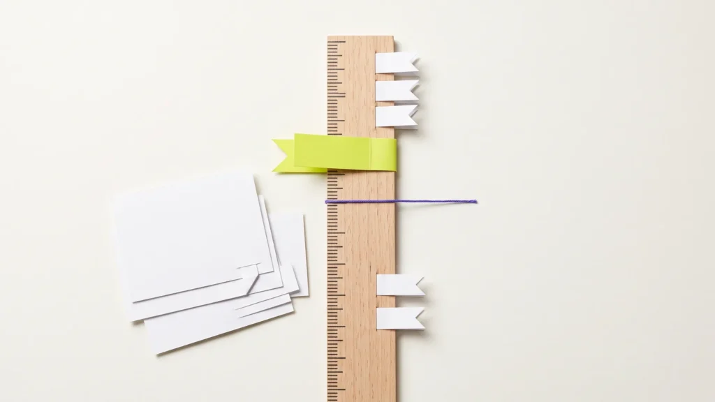
The titles on the ArtCraft sidebar don’t move as words. They move letter by letter. As a section comes up the screen, its title stands on its side along a ruler. Then each letter swings into place on its own, with a little spring. Below I take the effect apart and rebuild it the same way, with CSS for the ruler and a short script for the letters.
Scroll inside the demo further down, then hover the ruler. That’s what we’re building.
How the ArtCraft sidebar works
I opened the site in Chrome’s developer tools to see what drives it. Here’s what I found:
- A fixed strip, 60 px wide, sits on the right edge. It has
role="scrollbar"and reports the scroll position inaria-valuenow. - Inside it, a ruler is exactly as tall as the whole page, with a tick for every 1%. It moves with the content as you scroll.
- Each title is split into single letters, and every letter is its own
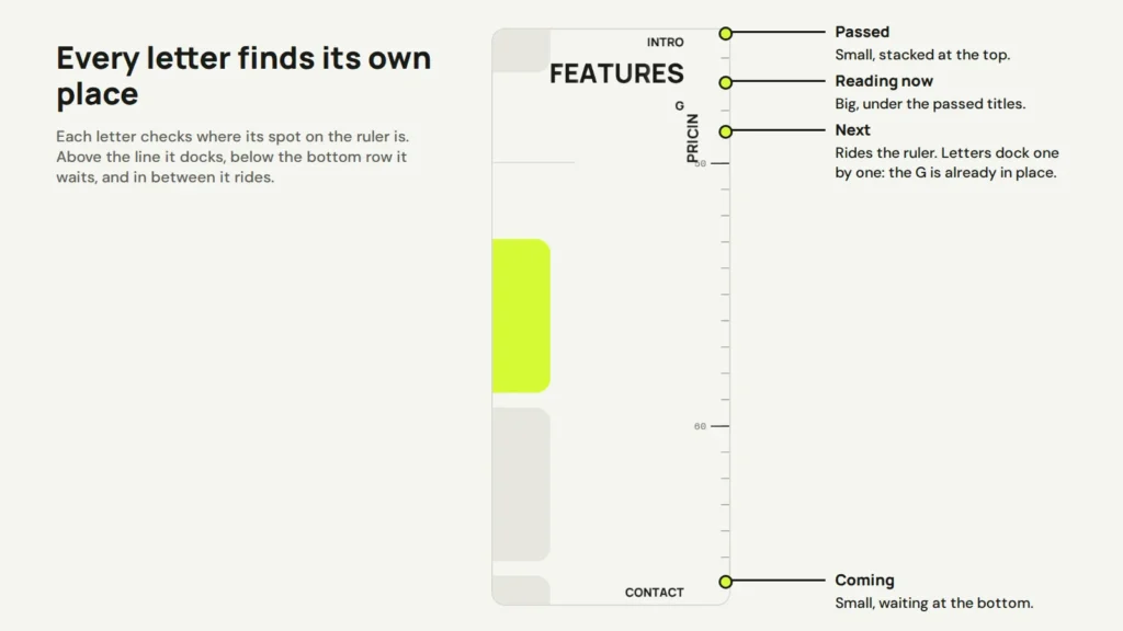
<span>. JavaScript sets atransformon each one, on every frame, with its own position, rotation and size. - While a section comes up, its letters stand on the ruler, rotated by -90 degrees. As each letter reaches the top, it swings flat and joins the stack. Passed titles are small, and the current one is big.
- On hover, the whole page squeezes into the ruler. A grey band shows what’s on screen, and a blue line shows the position as a number like
019%.
So the secret is that the letters don’t belong to the word. Each one only knows its own target, and springs towards it.
Steps 1 and 2: the page and a ruler that scrolls
Here’s the finished demo. It runs the HTML, CSS and JavaScript from this post and nothing else.
<div class="page">
  <section class="s s1" data-title="Intro" id="intro">
    <h2>Intro</h2>
    <p>Scroll this box. Watch the titles on the right.</p>
    <i class="card"></i><i class="card"></i>
  </section>
  <section class="s s2" data-title="Features" id="features">
    <h2>Features</h2>
    <i class="card"></i><i class="card"></i><i class="card"></i>
  </section>
  <section class="s s3" data-title="Pricing" id="pricing">
    <h2>Pricing</h2>
    <i class="card"></i><i class="card"></i><i class="card"></i>
  </section>
  <section class="s s4" data-title="Contact" id="contact">
    <h2>Contact</h2>
    <i class="card"></i><i class="card"></i><i class="card"></i>
  </section>

  <div class="ruler" aria-hidden="true">
    <i style="--n: 0">0</i>
    <i style="--n: 10">10</i>
    <i style="--n: 20">20</i>
    <i style="--n: 30">30</i>
    <i style="--n: 40">40</i>
    <i style="--n: 50">50</i>
    <i style="--n: 60">60</i>
    <i style="--n: 70">70</i>
    <i style="--n: 80">80</i>
    <i style="--n: 90">90</i>
    <i style="--n: 100">100</i>
  </div>
</div>

<div class="titles" aria-hidden="true"></div>

<nav class="rail" aria-label="Page sections">
  <span class="band"></span>
  <span class="now"></span>
  <a href="#intro" style="--i: 0; --at: 0%">Intro</a>
  <a href="#features" style="--i: 1; --at: 25%">Features</a>
  <a href="#pricing" style="--i: 2; --at: 50%">Pricing</a>
  <a href="#contact" style="--i: 3; --at: 75%">Contact</a>
</nav>
Each section has its title in data-title. The empty .titles layer is where the script puts the letters. The links in the nav mark where each section starts on the ruler, with --at, and the letters fly to them on hover.
Step 1 is plain page styling, with room on the right for the titles.
/* Step 1: the page and its sections */
body { display: block; padding: 0; place-items: normal; } /* undo the demo frame's centring */
.page { position: relative; padding-right: 150px; }
.s { min-height: 640px; padding: 28px 24px; border-bottom: 1px solid #D8D9D1; }
.s h2 { margin: 0 0 8px; font: 800 28px Manrope, sans-serif; }
.s p { margin: 0 0 16px; color: #5C5E57; }
.card { display: block; height: 150px; margin-bottom: 14px; border-radius: 14px; background: #E6E6DF; }
.s2 .card:first-of-type, .s4 .card:first-of-type { background: #171915; }
.s3 .card:first-of-type { background: #D5FA35; }
Step 2 is the ruler. It’s an absolute element as tall as the whole page, so it scrolls with the content like a tape measure. Two repeating gradients draw the ticks: a short one every 1% and a long one every 10%.
/* Step 2: a ruler as tall as the page, so it scrolls with the content (1 tick = 1%) */
.ruler {
  position: absolute; top: 0; right: 0; bottom: 0; width: 34px;
  background:
    linear-gradient(#171915 1px, transparent 0) right top / 18px 10% repeat-y,
    linear-gradient(#9A9C94 1px, transparent 0) right top / 8px 1% repeat-y;
  transition: opacity .3s;
}
.ruler i {
  position: absolute; right: 22px; top: calc(var(--n) * 1%); translate: 0 -50%;
  font: 400 9px "Space Mono", monospace; font-style: normal; color: #5C5E57;
}
.ruler i:last-child { translate: 0 -100%; }
Steps 3 to 5: the letter layer and the rail
Step 3 makes a fixed layer that covers the screen. Every letter sits at its top-left corner, and the script moves it from there with transform. Transforms don’t change the layout, so moving 30 letters every frame stays smooth.
/* Step 3: a fixed layer for the letters. JavaScript moves each one. */
.titles { position: fixed; inset: 0; pointer-events: none; z-index: 3; }
.titles span {
  position: absolute; top: 0; left: 0;
  font: 800 26px/1 Manrope, sans-serif; color: #171915;
  text-shadow: 0 0 4px #F5F5F0, 0 0 10px #F5F5F0;
  will-change: transform;
}
Step 4 is the rail on the right. It uses CSS only. A scroll timeline moves the blue line and counts a number from 0 to 100. The @property rule makes that number animate as a whole number, and a custom counter style pads it to three digits.
/* Step 4: the fixed rail, with a progress line, a percent counter
   and a band for what's on screen */
@property --p { syntax: "<integer>"; inherits: true; initial-value: 0; }
@counter-style pad3 { system: extends decimal; pad: 3 "0"; }
.rail { position: fixed; top: 0; right: 0; bottom: 0; width: 34px; z-index: 2; }
.rail::before {
  content: ""; position: absolute; inset: 0; opacity: 0; transition: opacity .3s;
  background:
    linear-gradient(#171915 1px, transparent 0) right top / 18px 10% repeat-y,
    linear-gradient(#9A9C94 1px, transparent 0) right top / 8px 2% repeat-y,
    #F5F5F0;
}
.now, .band { position: absolute; right: 0; width: 34px; opacity: 0; transition: opacity .3s; }
.now { height: 2px; background: #5B4AE8; animation: progress linear both; animation-timeline: scroll(root); }
.now::after {
  counter-reset: p var(--p); content: counter(p, pad3) "%";
  position: absolute; right: 2px; top: 4px; font: 700 9px "Space Mono", monospace; color: #5B4AE8;
}
.band {
  height: 22%; background: rgb(23 25 21 / .1); border-block: 1px solid rgb(23 25 21 / .4);
  animation: band linear both; animation-timeline: scroll(root);
}
@supports not (animation-timeline: scroll()) {
  .now, .band { display: none; }
}
@keyframes progress { from { top: 0; --p: 0; } to { top: calc(100% - 2px); --p: 100; } }
/* shortcut: band height is set by hand (screen height ÷ page height) */
@keyframes band { from { top: 0; } to { top: 78%; } }
Step 5 handles hover. The links are invisible boxes at each section’s spot on the short ruler. They still work with Tab, so keyboard users get the same menu.
/* Step 5: hover (or Tab into) the rail. The links mark where each section
   starts, and the letters fly to them. */
.rail a {
  position: absolute; right: 44px; top: var(--at); height: 20px; width: 110px;
  color: transparent; text-decoration: none; border-radius: 6px; font-size: 12px;
}
.rail a:focus-visible { outline: 2px solid #5B4AE8; }
.rail:is(:hover, :focus-within)::before,
.rail:is(:hover, :focus-within) :is(.now, .band) { opacity: 1; }
body:has(.rail:is(:hover, :focus-within)) .ruler { opacity: 0; }
Steps 6 and 7: split the titles and give every letter a target
Step 6 turns each title into letters. It measures every letter’s width, because the script lines them up by hand later.
// Step 6: split every section title into letters
const layer = document.querySelector('.titles');
const rail = document.querySelector('.rail');
const sections = [...document.querySelectorAll('[data-title]')];

const titles = sections.map((section, n) => {
  const letters = [...section.dataset.title.toUpperCase()].map((ch) => {
    const el = document.createElement('span');
    el.textContent = ch;
    layer.append(el);
    // x, y, rotation and scale, plus a speed for each (for the spring)
    return { el, w: el.offsetWidth, x: innerWidth, y: innerHeight, r: 0, k: 0.45, vx: 0, vy: 0, vr: 0, vk: 0 };
  });
  return { section, n, letters, link: rail.querySelectorAll('a')[n] };
});

const SMALL = 0.45;   // passed and coming titles
const BIG = 1;        // the title you're reading
const RIDE = 0.55;    // letters standing on the ruler
const ROW = 18;       // gap between stacked titles
const EDGE = 44;      // space for the ruler on the right
const calm = matchMedia('(prefers-reduced-motion: reduce)').matches;
let current = 0;      // the title you're reading (from the last frame)
Step 7 is the heart of it. On every frame, each letter works out its spot on the ruler, just above where its section starts. Then it checks that spot against two lines:
- Above the top line, the letter is docked. It lies flat in its title’s row at the top.
- Below the bottom row, it’s waiting in the stack at the bottom.
- In between, it rides the ruler, turned on its side.
Because each letter checks for itself, the top letter of a word docks first and the rest follow one by one. That’s the letter-by-letter effect. The title with every letter docked is the one you’re reading, so it gets the big size.
// Step 7: work out where every letter should be, one letter at a time
function targets() {
  const vw = document.documentElement.clientWidth;
  const vh = innerHeight;
  const count = titles.length;
  const overview = rail.matches(':hover, :focus-within');
  let reading = 0;

  for (const t of titles) {
    const top = t.section.getBoundingClientRect().top; // where the section starts on screen
    const word = t.letters.reduce((sum, l) => sum + l.w, 0);
    const topRow = 12 + t.n * ROW + (t.n > current ? 26 : 0); // make room under the big title
    const bottomRow = vh - 12 - (count - 1 - t.n) * ROW;
    let docked = 0;

    for (let i = 0; i < t.letters.length; i++) {
      const l = t.letters[i];
      const before = t.letters.slice(0, i).reduce((sum, o) => sum + o.w, 0);
      // its spot on the ruler: the word stands just above where its section starts
      const ride = top - (before + l.w / 2) * RIDE;

      if (ride < topRow + 8) {
        l.state = 'top'; docked++;
      } else if (ride > bottomRow - 4) {
        l.state = 'bottom';
      } else {
        l.state = 'ride';
      }
      l.before = before;
      l.ride = ride;
      l.word = word;
    }
    if (docked === t.letters.length) reading = t.n;
    t.topRow = topRow;
    t.bottomRow = bottomRow;
  }

  current = reading;

  for (const t of titles) {
    for (const l of t.letters) {
      let k = SMALL, x, y, r = 0;
      if (overview) {
        const box = t.link.getBoundingClientRect();
        x = box.right - (l.word - l.before - l.w / 2) * SMALL;
        y = box.top + box.height / 2;
      } else if (l.state === 'ride') {
        k = RIDE; r = -90;
        x = vw - EDGE + 8;
        y = l.ride;
      } else {
        if (l.state === 'top' && t.n === current) k = BIG;
        x = vw - EDGE - (l.word - l.before - l.w / 2) * k;
        y = l.state === 'top' ? t.topRow + (k === BIG ? 12 : 0) : t.bottomRow;
      }
      l.tx = x; l.ty = y; l.tr = r; l.tk = k;
    }
  }
}
Step 8: the spring that makes it feel alive
If letters jumped straight to their targets, the effect would feel stiff. Instead, each letter has a speed for its position, rotation and size. Every frame, the speed grows towards the target and loses a bit of energy. That gives the small overshoot you see when a letter swings flat.
// Step 8: move every letter towards its target with a small spring
function spring(l, key, speed, target) {
  if (calm) { l[key] = target; return; }
  l[speed] = (l[speed] + (target - l[key]) * 0.14) * 0.72;
  l[key] += l[speed];
}

function frame() {
  targets();
  for (const t of titles) {
    for (const l of t.letters) {
      spring(l, 'x', 'vx', l.tx);
      spring(l, 'y', 'vy', l.ty);
      spring(l, 'r', 'vr', l.tr);
      spring(l, 'k', 'vk', l.tk);
      l.el.style.transform =
        `translate(${l.x}px, ${l.y}px) translate(-50%, -50%) rotate(${l.r}deg) scale(${l.k})`;
    }
  }
  requestAnimationFrame(frame); // shortcut: runs every frame; pause it when nothing moves if you have many titles
}
document.fonts.ready.then(() => {
  for (const t of titles) for (const l of t.letters) l.w = l.el.offsetWidth; // measure again with the real font
  frame();
});
The two numbers in spring() set the feel. A bigger 0.14 makes letters faster, and a bigger 0.72 makes them wobble more. If someone has asked their system for less motion, the letters jump straight to their places instead.
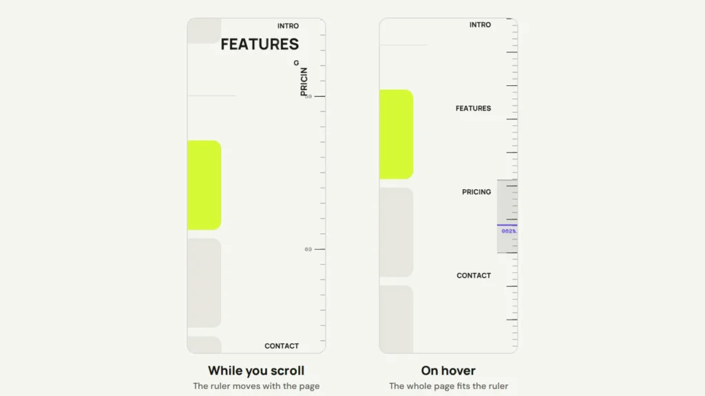
The links can’t jump inside the demo, because the frame is locked down. On your own page they scroll to each section, and scroll-behavior: smooth on html makes them glide.
Browser support and speed
- The letters, the ruler and the hover menu work in every current browser.
- The percent counter and the band use scroll-driven animations. They work in Chrome, Edge and Safari 26+. Firefox still has them behind a setting, so the demo hides them there.
- The loop runs on every frame, which is fine for a few titles. With many titles, I’d stop the loop once every letter has settled, and start it again on scroll.
The letters are copies of your real headings, hidden from screen readers with aria-hidden, so nothing is read twice. If you’d like a sidebar like this on your own site, we can build it for you.
Comments
No comments yet. Questions, fixes and better ways are all welcome.