Faster images, faster site: every trick, with examples

Images are usually the heaviest part of a web page, so they are the fastest way to make a slow site quick. Resize them, save them as WebP or AVIF, and lazy-load everything below the first screen. Then let a CDN and caching deliver them. Each trick below has an example you can copy.
I tested the tricks on a real product photo too, so you can see the numbers and the quality for yourself.
Why images slow your site down
The median mobile home page now weighs 2.56 MB, and 911 KB of that is images, according to the 2025 Web Almanac. That’s the median. Many shop pages are far heavier, because product photos go straight from the phone to the website.
Uploading a 5 MB photo to show it in a 400 px box is like posting a sofa to deliver one cushion. The visitor pays for the whole sofa in waiting time and mobile data. And speed matters for sales. In a study by Deloitte for Google, a 0.1 second faster mobile site lifted retail conversions by 8.4%.
Move the sliders below to see how much each trick changes a page. Start with 15 images, the median for a mobile page, and switch the tricks on one by one:
<div class="sim">
  <div class="ctl">
    <label class="sl"><span>Images on the page <b id="on">15</b></span><input type="range" id="n" min="1" max="40" value="15"></label>
    <label class="sl"><span>Size of each image <b id="os">1.2 MB</b></span><input type="range" id="s" min="100" max="5000" step="100" value="1200"></label>
    <label class="sl"><span>Visitor's internet speed <b id="ob">10 Mbps</b></span><input type="range" id="b" min="2" max="100" value="10"></label>
    <div class="tg">
      <label><input type="checkbox" id="rs"> Resize to fit</label>
      <label><input type="checkbox" id="lz"> Lazy load</label>
      <label><input type="checkbox" id="cdn"> CDN nearby</label>
      <label><input type="checkbox" id="rv"> Repeat visit (cached)</label>
    </div>
    <p class="fmt" role="radiogroup" aria-label="Format">
      <input type="radio" name="f" id="f1" value="1" checked><label for="f1">JPEG</label>
      <input type="radio" name="f" id="f2" value="0.63"><label for="f2">WebP</label>
      <input type="radio" name="f" id="f3" value="0.5"><label for="f3">AVIF</label>
    </p>
  </div>
  <div class="out">
    <div class="row"><b>Before</b><i><em id="ba"></em></i><span id="ta"></span></div>
    <div class="row me"><b>After</b><i><em id="bb"></em></i><span id="tb"></span></div>
    <p class="big"><strong id="mb"></strong> of images to download when the page opens. <span id="gb"></span></p>
  </div>
  <p class="note">A rough model, not a speed test. The resize and format numbers come from my mug photo test below.</p>
</div>
body { display: block; padding: 14px; place-items: normal; }
.sim { width: min(100%, 680px); margin: 0 auto; font-size: 15px; color: #171915; }
.sl { display: block; margin: 0 0 10px; }
.sl span { display: flex; justify-content: space-between; font-size: 14px; color: #5C5E57; }
.sl b { color: #171915; }
input[type=range] { width: 100%; accent-color: #171915; margin: 4px 0 0; }
.tg { display: flex; flex-wrap: wrap; gap: 8px; margin: 6px 0 10px; }
.tg label { display: flex; align-items: center; gap: 6px; padding: 6px 12px; border: 2px solid #D7D7D7; border-radius: 999px; background: #fff; cursor: pointer; font-size: 14px; }
.tg label:has(input:checked) { border-color: #171915; background: #FFD400; }
.tg input { accent-color: #171915; margin: 0; }
.fmt { display: flex; gap: 8px; margin: 0 0 12px; }
.fmt input { position: absolute; opacity: 0; }
.fmt label { padding: 6px 16px; border: 2px solid #171915; border-radius: 999px; background: #fff; cursor: pointer; font-weight: 700; font-size: 14px; }
.fmt input:checked + label { background: #171915; color: #fff; }
input:focus-visible + label, .tg label:has(input:focus-visible) { outline: 3px solid #5B4AE8; outline-offset: 2px; }
.out { background: #fff; border: 2px solid #E4E4E4; border-radius: 14px; padding: 14px; }
.row { display: grid; grid-template-columns: 60px 1fr 64px; align-items: center; gap: 10px; margin-bottom: 10px; }
.row b { font-size: 14px; }
.row i { height: 26px; background: #F1F1F1; border-radius: 6px; overflow: hidden; }
.row em { display: block; height: 100%; background: #9A9C94; border-radius: 6px; transition: width .4s ease; }
.row.me em { background: #FFD400; box-shadow: inset 0 0 0 2px #171915; }
.row span { font-weight: 700; text-align: right; }
.big { margin: 4px 0 0; font-size: 14px; color: #3F413B; }
.big strong { color: #171915; }
.note { margin: 10px 0 0; font-size: 12.5px; color: #5C5E57; }
@media (max-width: 560px) { body { padding: 8px; } .row { grid-template-columns: 52px 1fr 56px; } .tg label { font-size: 13px; padding: 5px 10px; } }
@media (prefers-reduced-motion: reduce) { .row em { transition: none; } }var $ = function (id) { return document.getElementById(id); };
function mb(kb) { return kb >= 1000 ? (kb / 1000).toFixed(1) + ' MB' : Math.round(kb) + ' KB'; }
function secs(kb, mbps, rtt) { return (kb * 8 / 1000) / mbps + 3 * rtt; }
function calc() {
var n = +$('n').value, s = +$('s').value, bw = +$('b').value;
var f = +document.querySelector('input[name=f]:checked').value;
// shortcut: fixed ratios from the mug test (resize 0.15, WebP 0.63, AVIF 0.5) and 3 round trips; real pages vary.
var each = s * ($('rs').checked ? 0.15 : 1) * f;
var count = $('lz').checked ? Math.min(n, 3) : n;
var kb = $('rv').checked ? 0 : each * count;
var rtt = $('cdn').checked ? 0.02 : 0.16;
var a = secs(n * s, bw, 0.16), b = secs(kb, bw, rtt);
var max = Math.max(a, b, 0.1);
$('on').textContent = n; $('os').textContent = mb(s); $('ob').textContent = bw + ' Mbps';
$('ba').style.width = (a / max * 100) + '%'; $('bb').style.width = Math.max(b / max * 100, 1) + '%';
$('ta').textContent = a.toFixed(1) + ' s'; $('tb').textContent = b.toFixed(1) + ' s';
$('mb').textContent = mb(kb);
var saved = (n * s - kb) * 1000 / 1e6;
$('gb').textContent = saved > 0.05 ? 'That saves about ' + saved.toFixed(1) + ' GB of data for every 1,000 visits.' : '';
}
document.querySelectorAll('input').forEach(function (el) { el.addEventListener('input', calc); });
calc();Shrink every image before it goes online
This is the trick with the biggest win, and it costs nothing. I took one product photo, a mug on linen, straight from the editor. Then I resized it to 1600 px wide and saved it in three formats:
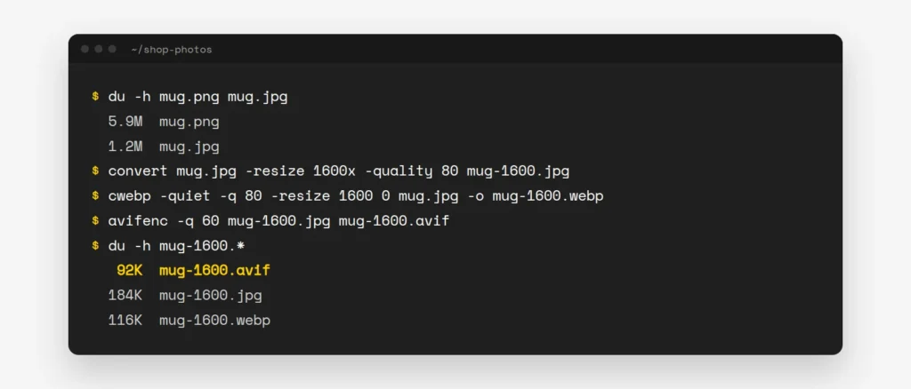
The original was a 5.9 MB PNG. The AVIF at 1600 px is 92 KB, which is 98% smaller. Now the fun part. Can you see the difference?

- Resize first. Most layouts never show an image wider than 1600 px, even on a big screen. A 4000 px photo just wastes the visitor’s data.
- Pick a modern format. Google says WebP files are 25 to 34% smaller than JPEG at the same quality. AVIF can be “up to 50% smaller than JPEGs“, and all major browsers support both.
- Use PNG only for logos and screenshots with sharp edges and few colours. Never for photos.
No terminal? Use Squoosh, a free tool from Google’s Chrome team that works in your browser. Drop in a photo, set the width, pick WebP or AVIF and download. If you like the terminal, these are the commands from my test. They use ImageMagick, cwebp and avifenc:
convert mug.jpg -resize 1600x -quality 80 mug-1600.jpg
cwebp -q 80 -resize 1600 0 mug.jpg -o mug-1600.webp
avifenc -q 60 mug-1600.jpg mug-1600.avif
On WordPress, install Modern Image Formats from the WordPress Performance Team. It saves new uploads as AVIF or WebP, and you choose which in Settings → Media. It only changes new uploads, so run wp media regenerate for older ones. WordPress also shrinks any upload wider than 2560 px by itself. On Shopify, you don’t need any of this. Shopify’s CDN checks what each browser supports and sends WebP or AVIF by itself.
Send the right size, at the right time
A phone doesn’t need the same image as a 27-inch screen. With srcset, you list a few sizes and the browser picks the smallest one that still looks sharp. Always add width and height too. They let the browser keep the space free, so the text doesn’t jump down when the image arrives.
<img src="mug-800.webp"
     srcset="mug-400.webp 400w, mug-800.webp 800w, mug-1600.webp 1600w"
     sizes="(max-width: 600px) 100vw, 50vw"
     width="1600" height="1073"
     alt="Speckled mug with a yellow inside">
The good news is that WordPress writes all of this for you, for every image you add from the Media Library. Shopify’s image_tag filter does the same.
Next, decide what loads first. Lazy loading means an image only downloads when the visitor scrolls near it. It’s great for everything below the first screen. But never lazy-load your main image at the top, because the browser will wait to load the most important picture on the page.
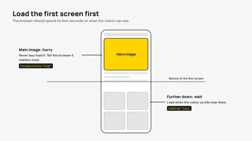
<!-- The main image at the top: load it first -->
<img src="hero-1600.avif" fetchpriority="high" width="1600" height="900" alt="New autumn range">

<!-- Images further down: load them later -->
<img src="mug-800.webp" loading="lazy" width="800" height="536" alt="Speckled mug">
Since WordPress 6.3, WordPress adds fetchpriority="high" to the image it thinks is the main one, and leaves lazy loading off the first few images. Some page builders and sliders undo this, so check your own pages.
Background images and placeholders
Many themes put the big hero picture in a CSS background image. It looks the same, but it loads later. The browser only finds the image after it downloads and reads the CSS file, as Shopify’s theme guide explains. A normal <img> tag is found straight away. You can still make it fill the section like a background:
.hero { position: relative; }
.hero img { position: absolute; inset: 0; width: 100%; height: 100%; object-fit: cover; }
.hero .hero-text { position: relative; z-index: 1; }
If you must keep a CSS background, tell the browser about the image early. Put this in the <head> of the page:
<link rel="preload" as="image" href="/images/hero-1600.avif" fetchpriority="high">A placeholder is what visitors see while an image loads. The simplest one is a background colour that matches the photo, so they see a calm beige box instead of a white hole. Some sites use a tiny blurred copy of the photo instead, which sharpens when the real image arrives. It doesn’t make the page faster, but it feels faster, and the visitor notices that.
<img src="mug-800.webp" loading="lazy" width="800" height="536"
     style="background-color: #E9E4DC" alt="Speckled mug">
CDN, caching and hosting: the delivery side
Small files still have to travel. If your server is in the US and your customers are in Melbourne, every image crosses the Pacific. A CDN (content delivery network) keeps copies of your images on servers around the world, so they come from a city near the visitor. It’s like a shop keeping stock in local warehouses instead of shipping everything from one factory.
- A CDN: Cloudflare’s free plan is the easiest start. My Cloudflare 101 guide walks through the setup.
- Caching: tell browsers to keep images for a year, so a returning visitor loads them from their own device.
- Hosting: pick a host with servers near your customers and HTTP/2 or HTTP/3 turned on. A cheap, crowded server makes everything slow, not only images.
On an Apache host, this goes in the .htaccess file in your site’s main folder. Nginx hosts have a similar setting, so ask your host if you’re not sure.
<IfModule mod_expires.c>
  ExpiresActive On
  ExpiresByType image/avif "access plus 1 year"
  ExpiresByType image/webp "access plus 1 year"
  ExpiresByType image/jpeg "access plus 1 year"
  ExpiresByType image/png "access plus 1 year"
</IfModule>
Be careful with long caching. If you replace an image but keep the same file name, returning visitors will see the old one for a year. Upload changed images under a new name instead. If your library is huge, my post on where to host your images compares S3, R2 and your own server.
Test it, then stop fiddling
Run your page through PageSpeed Insights before and after. Look at Largest Contentful Paint (LCP), the time until the biggest thing on the screen appears. Google calls it good at 2.5 seconds or less. On most pages, that biggest thing is an image.
To check that caching works, look at the headers of one image in a terminal. My guide to checking headers with curl explains each line.
curl -sI https://example.com.au/wp-content/uploads/2026/10/mug-800.webp | grep -iE "^(content-type|cache-control|expires|cf-cache-status)"Once your main page is under 2.5 seconds, go and do something else. Past that point, I’d spend the time on better photos and product text. If you’d like us to speed up your images for you, our site updates service covers it.
Opens in a new tab


Comments
No comments yet. Questions, fixes and better ways are all welcome.