Lesson 01 LearningCheat sheets
Flexbox cheat sheet: every property, value and default
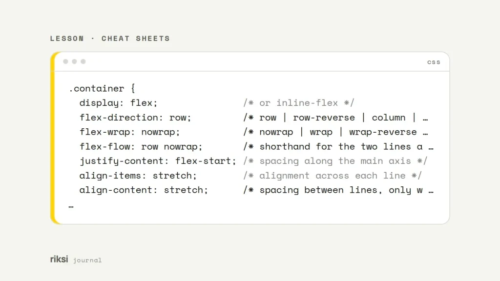
You want a row of items to line up, and you can’t remember which property does what. This page lists every flexbox property, with its values and defaults. Flexbox lays out items in one direction, a row or a column. It controls how they grow, shrink and line up. Put display: flex on the parent (the flex container). Its direct children become flex items. Everything else is a small set of container and item properties, listed below with their values and defaults.
The two axes
Most flexbox questions come down to the two axes. The main axis runs in the direction set by flex-direction. That’s left to right for row, and top to bottom for column. The cross axis runs across it. It’s a bit like a bookshelf, where the books line up along the shelf. Stand the shelf on its end, and the same books now stack from top to bottom.
The justify-* properties work along the main axis. The align-* properties work along the cross axis. So when you switch to column, a different property centres things horizontally. Learn the two axes first. Everything else follows from them.
Container properties
| Property | Values | Default |
|---|---|---|
display |
flex, inline-flex |
n/a |
flex-direction |
row, row-reverse, column, column-reverse |
row |
flex-wrap |
nowrap, wrap, wrap-reverse |
nowrap |
flex-flow |
Shorthand for direction, then wrap. For example row wrap |
row nowrap |
justify-content |
flex-start, flex-end, start, end, center, space-between, space-around, space-evenly |
normal (acts as start) |
align-items |
stretch, flex-start, flex-end, start, end, center, baseline |
normal (acts as stretch) |
align-content |
flex-start, flex-end, center, space-between, space-around, space-evenly, stretch |
normal (acts as stretch) |
gap, row-gap, column-gap |
A length or percentage | normal (0 in flexbox) |
.container {
  display: flex;               /* or inline-flex */
  flex-direction: row;         /* row | row-reverse | column | column-reverse */
  flex-wrap: nowrap;           /* nowrap | wrap | wrap-reverse */
  flex-flow: row nowrap;       /* shorthand for the two lines above */
  justify-content: flex-start; /* spacing along the main axis */
  align-items: stretch;        /* alignment across each line */
  align-content: stretch;      /* spacing between lines, only when wrapping */
  gap: 1rem;                   /* row-gap column-gap */
}
Details that often confuse people:
space-betweenputs no space at the ends.space-aroundputs half-size gaps at the ends.space-evenlymakes every gap the same, including the ends. The three names are very close, so it’s normal to look them up more than once.align-contentonly does something when items wrap onto more than one line. On a single-line container (flex-wrap: nowrap) it has no effect, so usealign-itemsinstead.- You can add the keyword
safe, as injustify-content: safe center. It stops overflowing content from being pushed past the start edge, where nobody can scroll to it. I’d use it whenever centred content might grow bigger than its box.
Item properties
| Property | Values | Default |
|---|---|---|
order |
Any whole number. Lower numbers come first | 0 |
flex-grow |
A number. The share of spare space the item takes | 0 |
flex-shrink |
A number. How easily it shrinks when space runs out | 1 |
flex-basis |
auto, content, a length or percentage |
auto |
flex |
Shorthand for grow, shrink and basis | 0 1 auto |
align-self |
auto, flex-start, flex-end, center, baseline, stretch |
auto (uses the container’s align-items) |
The flex values to remember
flex: initialis0 1 auto, the default. The item is sized by its content or width. It can shrink, but it never grows.flex: autois1 1 auto. It starts from its content size, then shares the spare space.flex: 1is1 1 0%. It starts from zero, so items withflex: 1end up the same width whatever their content. It’s like splitting a bill evenly, whatever each person ordered. I find this the most useful one to know.flex: noneis0 0 auto. The item stays at its natural size.flex: 0 0 240pxgives you a fixed 240px sidebar that won’t grow or shrink.
Two things to watch for
Flex items won’t shrink below their minimum content size. So a long URL or a <pre> block can push out of its column. Add min-width: 0 to the item to fix it. It’s the first thing I check when a flex layout overflows.
Also, order only changes what people see. Keyboard focus and screen readers still follow the order of the HTML source. If you move important content around visually, the page can be confusing to navigate. It’s one of the things I check in accessibility audits.
Use gap instead of margins
gap adds space between items only, never on the outer edges. So you don’t need negative margins or :last-child resets any more. It’s a CSS property that does exactly what its name says, which is always nice to see. It has worked with flexbox in every major browser since Safari added support in 2021. With two values, as in gap: 1rem 2rem, the first is the row gap and the second is the column gap. My advice is to use gap for all the space between flex items.
Layouts you’ll use every week
Here are the four I use most.
Centre anything
.center {
  display: flex;
  justify-content: center;
  align-items: center;
  min-height: 100vh;
}
Nav bar with the logo left and links right
.nav {
  display: flex;
  align-items: center;
  gap: 1rem;
}
.nav .logo {
  margin-right: auto; /* an auto margin soaks up all the spare space */
}
Use margin-left: auto or margin-right: auto to push items apart. An auto margin works like a spring between the items. It stretches to fill all the free space.
Cards that wrap
.cards {
  display: flex;
  flex-wrap: wrap;
  gap: 1.5rem;
}
.card {
  flex: 1 1 250px; /* aim for 250px, grow to fill the row */
}
Cards on a short last row stretch wider than the others. If you need every column the same width, that’s a two-dimensional layout. CSS Grid is the better tool for that, with grid-template-columns: repeat(auto-fill, minmax(250px, 1fr)).
Footer that sticks to the bottom
body {
  display: flex;
  flex-direction: column;
  min-height: 100vh;
}
main {
  flex: 1; /* main takes the leftover height, pushing the footer down */
}
Why the -webkit-box lines are gone
Older cheat sheets stacked five display lines. The first version of this one did too. They come from three different drafts of the specification:
display: -webkit-boxand-moz-boxare the 2009 syntax, with properties likebox-flexandbox-ordinal-group.-ms-flexboxis the 2012 draft that Internet Explorer 10 used.flexis the finished standard.
The drafts didn’t behave the same way. The 2009 version could not even wrap lines. So the prefixed lines never gave you the same layout.
Every current browser has supported the standard, unprefixed properties for years. Internet Explorer was the last browser that needed a prefix, and Microsoft retired it in 2022. If a project really has to support a very old browser, I wouldn’t write prefixes by hand. Let Autoprefixer, a build tool, add them from a browserslist setting. My Gulp setup for Sass and JavaScript names the plugins you need.
The one place you’ll still see display: -webkit-box is multi-line text truncation with -webkit-line-clamp. That’s a text trick that reuses the old syntax, not a layout method.
Use flexbox for one row or one column. Use Grid when you need rows and columns at the same time.
I’d start with flexbox and only switch to Grid when a layout needs both. Now go and delete those old prefixed display lines. Just leave the line-clamp one where it is.


Comments
No comments yet. Questions, fixes and better ways are all welcome.